Thursday, November 03, 2011

Obesity and Diabetes. Timeline from 1980 to 2008.

The Washington Post has an animated graph showing growth in BMI (Body Mass Index) and diabetes for countries around the world (click on the picture to go to the site). For example, over the last thirty years, BMI for US population has increased about 15%, from 25 (Normal) to 28.5 (Overweight).


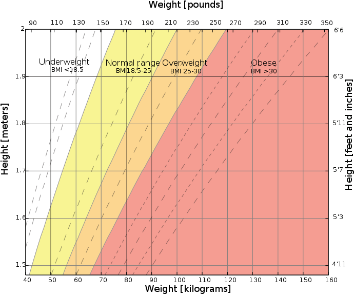
You can look up your BMI using the chart below.


Just as a side note, presenting data as a animated chart is a very powerful technique. It makes any meangful statistical point visible. In this regard, electronic textbooks will have a big advantage over printed media.

tags: health, care, problem, information, s-curve

No comments: